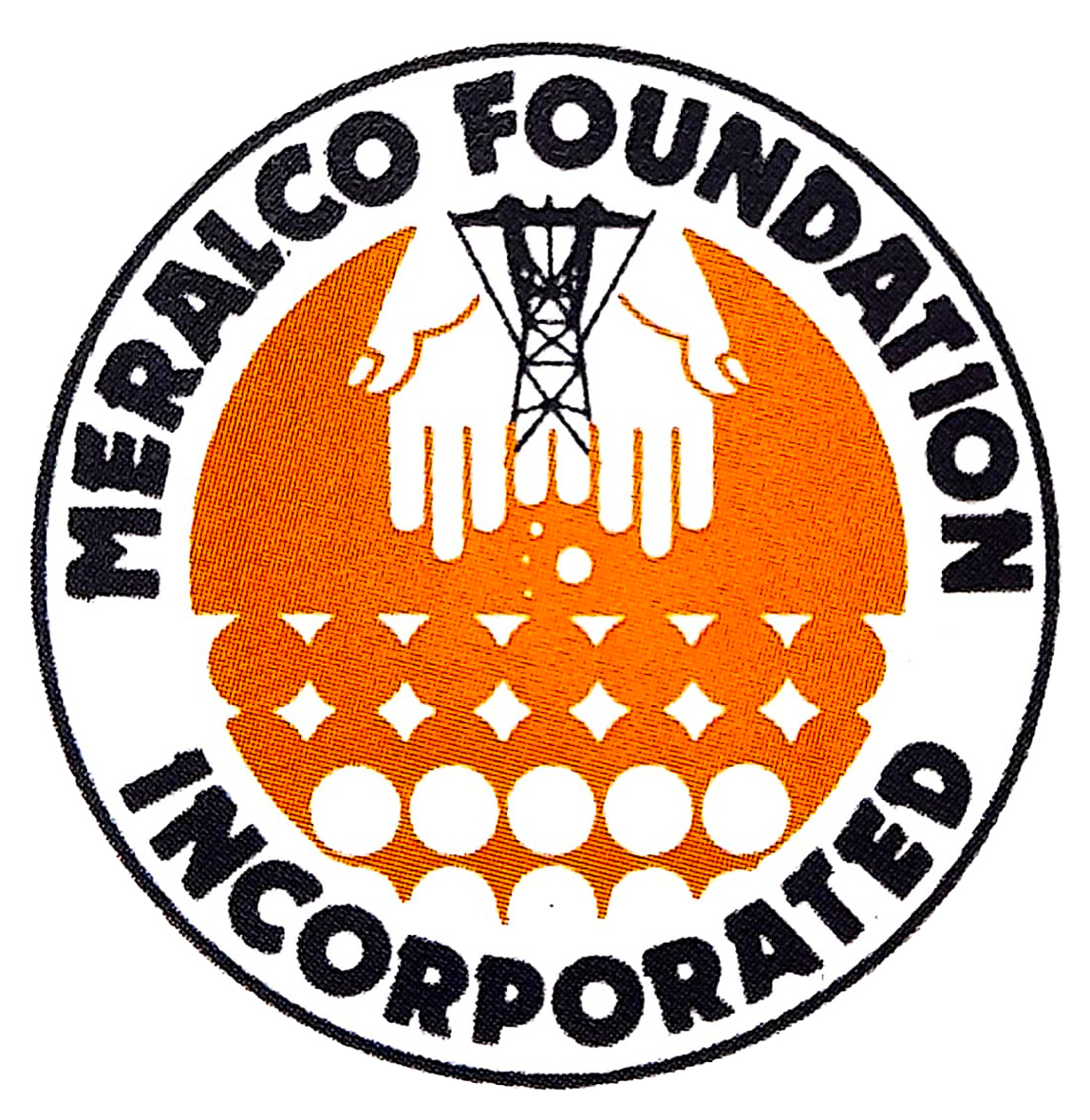
The original MFI logo symbolized MFI’s character as a holding foundation put up in 1973 to manage the Meralco Ownership
Dispersal Program (MODP). Embodying Meralco’s corporate social responsibility, it sought to distribute some of the profits arising from operation by making its customers part proprietors of the company through ownership of Meralco shares of stocks.
Predominant in this logo were the colors orange and black, the same corporate colors of Meralco.From two wide-open palms flowed treasures meant for the community. At the center of the palms was a transmitter tower which identified MFI with Meralco. Around the circular logo were the the words “Meralco Foundation, Incorporated”.

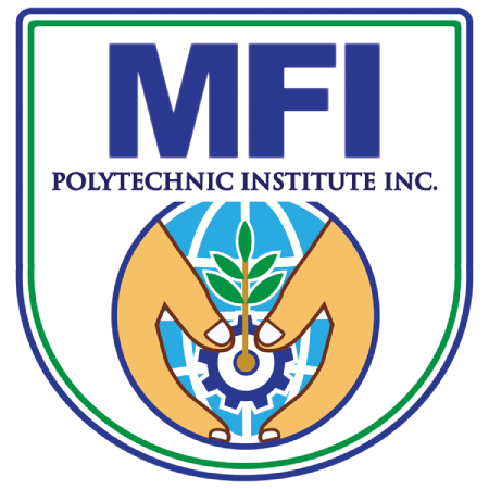
The present logo, adopted in 1998, reflects MFI’s commitment to service that seeks the development of the FIlipino, especially those who have less in life.
The logo is a shield that symbolizes MFI’s weapons against poverty, unemployment, and mediocrity. These weapons consist of programs, projects, and partnership that nurture human development and foster hope for gainful living.
Rendered in royal blue – the new MFI corporate color, the present logo portrays MFI’s service orientation,as seen in the two hands that are depicted in a nurturing, protectng fashion.
The logo also features a house symbolizing the family which is the nucleus of society. A gear, a young plant, and water represent MFI’s commitment to the development of industry, agriculture, and aquaculture through quality education, training, and research. The pearl is symbolic of the Philippines, often called the “Pearl of the Orient Seas.” Behind these symbols is the globe that represent MFI’s efforts to make the Filipino a dynamic member of the global community.
Emblazoned on the shield are the letters MFI, a name identified with the filipino dream of a dignified way of life.

